How To Use Color In Your Home to Achieve the Right Ambience
Choosing a color scheme is one of the most important decisions you can make for your home interiors. The impact of color is simply enormous. Different tones and shades have the power to visually change the shape and size of the room and the furnishings within it, making it imperative that you get your room scheme right. Read on to find how to use color in your home to achieve the right ambiance.
You probably already know that light colors are airy and expansive, while dark colors can make the room cozy and intimate, or add drama. There are active, passive and neutral colors, all able to influence the room in different ways.

With a bit of understanding on how colors affect us all psychologically, you can create just the right ambiance in your home. I spoke to interiors experts Pfeiffer Design to put together an overview of how to use color to best effect.
How to Use Color In Your Home
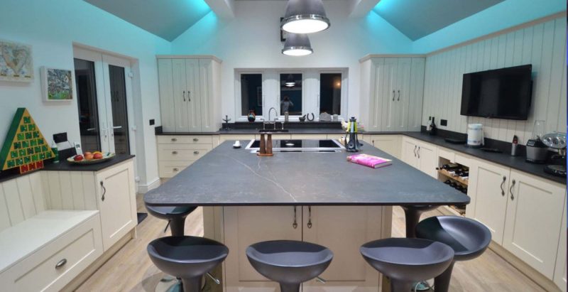
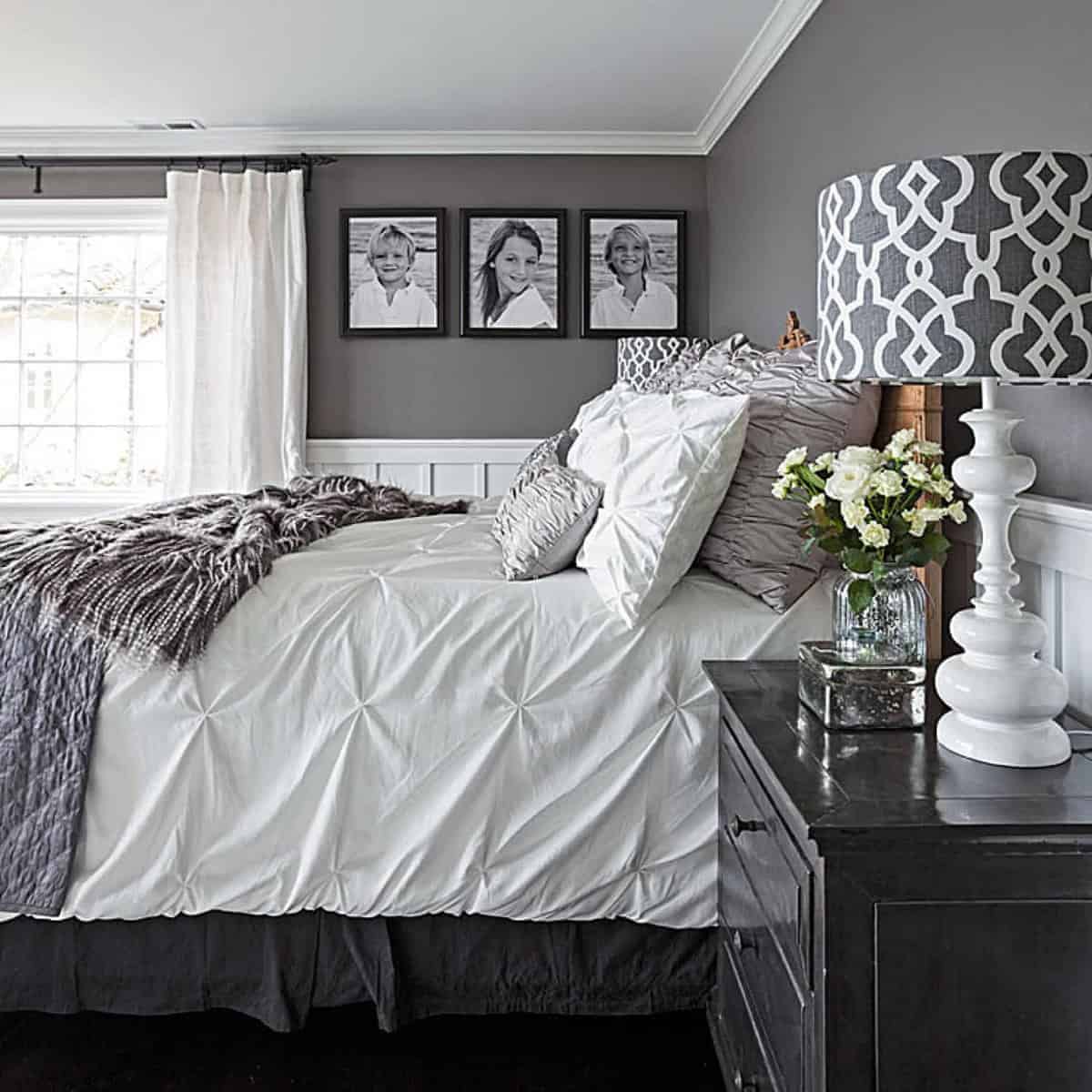
Neutrals
Neutral tones – white, off white, grey, beige, brown – are the basic tools of any interior designer’s tool box. While trends for neutral color schemes come and go, there’s no denying the fact that these are the most versatile colors.

Start with a basic neutral palette for a clean, calm, blank canvas look that’s perfect for selling your home, accessorizing with colorful soft furnishings as you wish. Or use a neutral interiors scheme as a backdrop for accent color to bring the room alive. It’s up to you.
Red
Red is an active color that increases the energy in the room. It is a great choice for convivial spaces such as living rooms and dining rooms, able to draw people together and stimulate conversation. Red can create excitement and drama and is a wonderful color for hallways and foyers to create a strong first impression. Use red carefully as a bit of this color goes a long way.
Red has also been shown to increase the heart rate, breathing and blood pressure, which is why it is typically considered too intense for bedrooms. Be particularly careful about red color schemes in children’s bedrooms – you want to calm the energy down at night, not turn it up.
Yellow
Yellow is a happy, sunny color that communicates joy – perfect for the active energy of kitchens, bathrooms and dining rooms. In hallways, entrance halls and small rooms, yellow can feel inviting and expansive.

However, strong yellows can have an overstimulating effect and should be used with caution as the main interiors scheme. In chemotherapy, yellow is used to stimulate the nerves, while research has shown that large amounts of yellow can increase feelings of anger and frustration, both for adults and children. Unless it is a very pale yellow, use it in small doses.
Blue
Blue is a calming and relaxing color, said to lower blood pressure and heart rate and slow down breathing. It’s a fantastic color for bedrooms and bathrooms. However, blue can be a cold color, particularly in rooms that don’t get a lot of natural light.

Soft blue shades are best but light blues will benefit from being balanced up by warmer hues in soft furnishings. For social areas in the home, such as living rooms or kitchen/diners, use warmer or brighter blue shades including turquoise, teal, periwinkle and stay away from dark blues that can feel mournful. Yellow and blue are classic color combinations.
Green
Green is a restful and harmonious color that combines the cheerfulness of yellow with the calming qualities of blue. It is suited to pretty much any room in the house and works well to achieve a tranquil and relaxing overall ambience in the home. Depending of the hue or shade, green can be a neutral color or not. A pale, mossy green with a green table lamp may function as a neutral, while a bright apple green would not.

As an interiors scheme, green is a versatile choice that can be used to inject a sense of the natural world into kitchen spaces, while encouraging comfort and togetherness in living rooms and family rooms.
Orange
Orange is an upbeat and enthusiastic color that really enlivens the energy of any room scheme. Its effect may be too strong a color for a living room or a children’s room, unless used as an accent. Orange is more often used in Modern style interiors.
That said, orange can be the perfect background scheme for noisy kids’ playrooms, home gyms and exercise rooms where it will encourage you to bring out all the emotions you need to release during your activity.
Purple
Purple is dark and dramatic, rich and sophisticated. It is associated with luxury, creativity and spirituality – purple robes were worn by royalty and people of authority throughout history. Adding purple to your room scheme lifts it above the ordinary and gives the scheme depth.

Lighter shades of purple, such as lavender and lilac, can be used to achieve the same calming qualities as blue except with much more warmth.
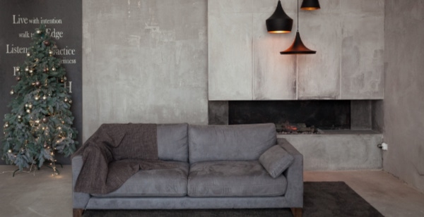
Black
Black can be very sexy, dramatic, or elegant. It may express a sense of power, boldness, restraint, or sadness. For some reason, when I think of a black room, I think of Elvis Presley. His predominantly black room is studded with silver accents, black leather couches, and images of shiny guitars, motorcycles, and cars. I also think of Johnny Cash – but his black room is more somber.
Today, black is a popular color for kitchen cabinets whether Modern or Traditional. You won’t be surprised to hear that black should be used with caution in any interior color scheme. Used incorrectly, it can be oppressive and dreary.

Black is typically used as an accent color and works wonders to add depth to a room scheme. Many designers make a point to always add some element of black to a space as a way to add depth. The trick is to pair it cleverly with other colors, using a color wheel to guide you.
Final Thoughts on How to Use Color in Your Home
Color is like the 4th dimension in a 3-dimentional space. It can make a statement – and can certainly affect the ambiance of a space. Use neutral colors to calm things down and intense colors to liven things up. View a similar article about >>> Applications of Color in Interior Design.
About Us
If you are looking for table lamps, floor lamps, wall mirrors, chandeliers, pendants, or wall art from top name brands, visit FineHomeLamps.com.